
Why youth shirts need their own placement rules
Many operators use the same chest position for youth shirts that they use on adult garments, then wonder why the artwork looks too low or too wide. A child or teen size has a shorter torso, narrower chest, and less vertical space between neckline and hem. That means a design that looks balanced on a medium adult shirt can sit awkwardly on a youth 9 to 10 size.
The real issue is not only size, but proportion. A logo that is 280 mm wide may be perfectly fine on an adult tee, yet overpower a youth garment and interfere with seams, side shaping or the natural drape of the fabric. Placement needs to respect the smaller canvas. If the print sits too low, it can get covered by a backpack strap or appear visually heavy. If it sits too high, it can crowd the neck area and make the shirt look cramped.
In practice, youth placement should always start from the garment size and not from the artwork size first. That small shift in thinking makes a noticeable difference on press.
How to judge the print zone before you load the platen
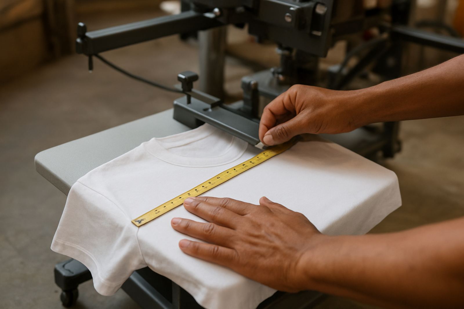
Before any shirt goes onto the platen, measure the usable front panel. On many youth garments, the safe print zone is narrower and shorter than expected, especially on garments with side seams or smaller neck openings. The print may need to be reduced by 10 to 20 percent compared with an adult version, depending on the artwork.
For shops that print across different brands and fabric weights, the rule is simple: do not trust the label size on its own. Lay the shirt flat, check shoulder width, chest width and neckline depth, then mark the centreline with chalk or a washable guide. If the shirt is extra soft or stretches easily, take that into account because the fibres can shift during loading and cure. On humid days in Durban, for example, some cotton tees behave differently than they do in dry Johannesburg air and the print can move slightly if the garment is handled too soon.
- Measure the garment laid flat, not hanging on a hook
- Check neckline depth before choosing the top margin
- Reduce artwork size where the youth chest is narrow
- Test the first sample before running a full batch
Centre points that work better for smaller bodies
Adult placement often uses a standard centre point from the neckline down. Youth garments need more judgement. A design can be centred correctly by measurement and still look off because the torso is shorter. A slightly higher placement is often better for smaller sizes, but only by a modest amount. Push it too high and the print starts fighting with the collar line.
A useful approach is to treat the neckline as the anchor and then adjust for the age group. For younger children, the top of the artwork may sit closer to the collar than on a teen shirt. For teens, the gap can be a touch lower, but still tighter than adult sizing. This is where platen size and print support matter, because a platen that is too large can tempt operators into using adult habits on youth garments.
When our team works with shops in Crown Mines, Sandton, or Pretoria East, we usually check three things first: neckline, chest width and the expected wearer age. That gives a better starting point than using one fixed measurement for every shirt.
- Younger sizes usually need a higher visual centre
- Teen sizes can sit slightly lower than children’s sizes
- One fixed template rarely suits every youth garment
Fabric stretch, seams and why youth garments shift more easily
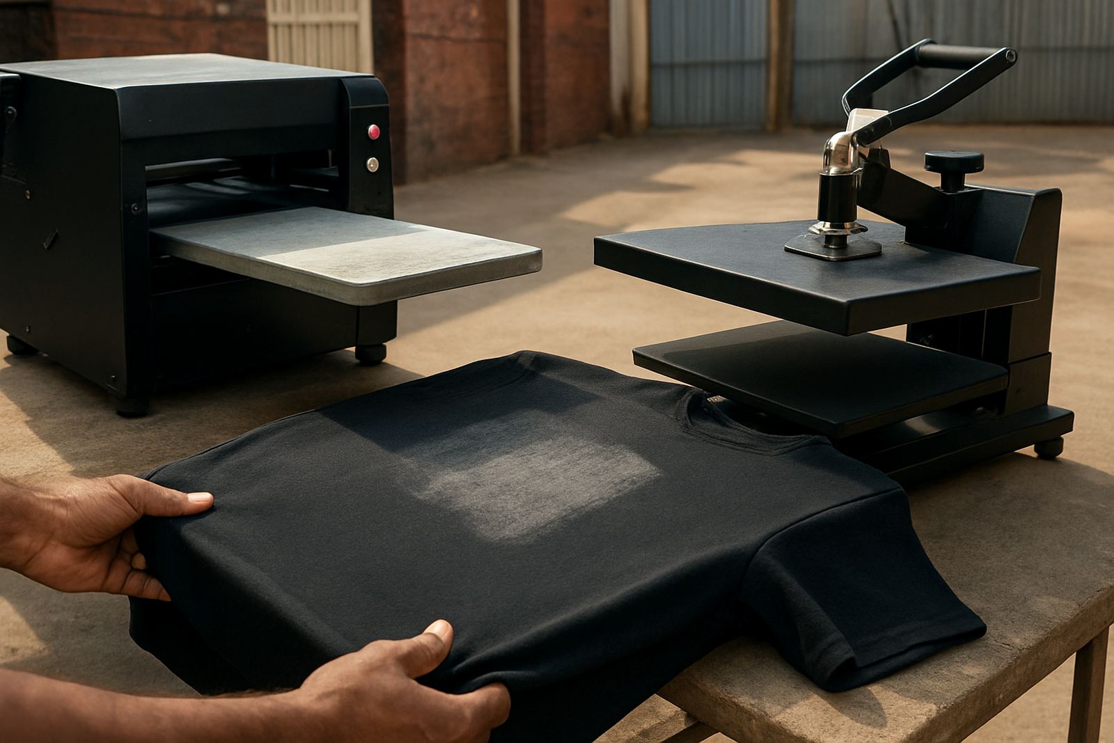
Youth garments often have lighter fabric, shorter side seams and softer ribbing around the neck. That makes them easier to load, but also easier to distort. If the shirt is pulled too hard over the platen, the print zone can become stretched, then spring back after curing and leave the artwork sitting slightly off. This is why platen setup matters as much as artwork sizing.
Another common issue is seam interference. On a small garment, the print area may sit closer to the armhole or side seam than expected. That can affect pretreatment coverage, print consistency and final hand feel. A print that looks perfect on a sample size 14 may start clipping the seam on a size 8, especially with fuller chest artwork. It is worth checking the garment while it is loaded, not just when it is flat on the table.
When print shops in Randburg or Midrand are scaling up youth runs for schools, sports clubs, or promotional campaigns, these small shifts matter. One misaligned batch can eat into time and material fast, especially when the courier deadline is tight.
A practical setup flow for better youth placement
Good youth placement becomes easier when the workflow is the same every time. Start with garment class, then size, then artwork width, then placement height. After that, confirm platen choice and pretreat coverage if the fabric needs it. If you are switching between adult and youth runs during the day, separate your set-ups so the measurements do not bleed into one another.
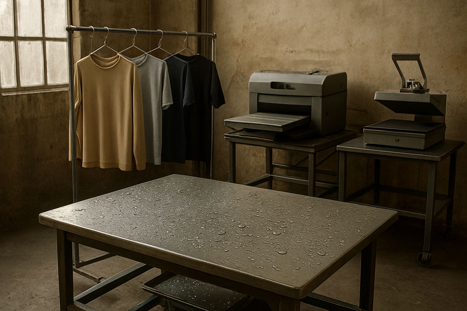
A simple in-shop routine helps keep things steady, especially when operators are working around load-shedding schedules or trying to finish a batch before courier pickup. Use a marked reference point on the platen, keep a youth sizing chart near the press, and confirm the first shirt visually before the run starts.
- Keep a separate youth placement chart by size band
- Mark centre and top reference points on the platen
- Check the first print before starting the full order
- Record which garment types need adjusted height or width
Local example: school and club orders in Gauteng
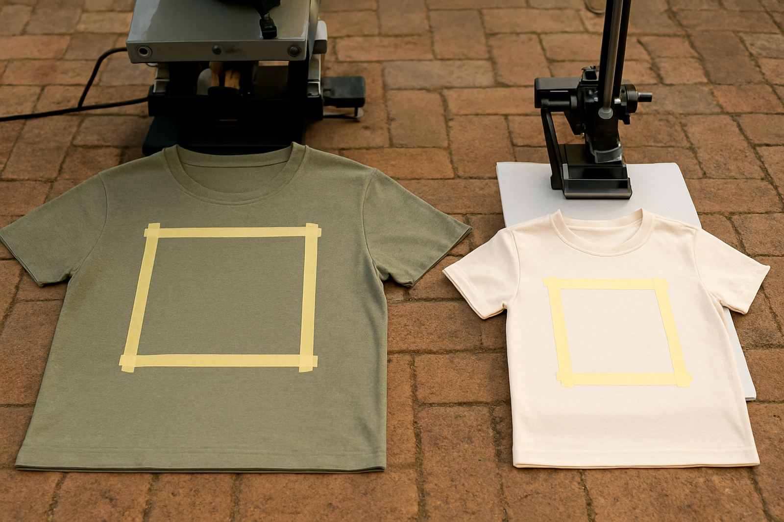
A print shop in Centurion was handling a mixed order of youth school shirts and adult staff shirts for a sports day. The adult artwork sat well on the larger sizes, but the youth tees looked heavy and too low on the chest. The team adjusted the youth version by trimming the width, lifting the placement slightly, and using a smaller platen for the smaller sizes. The result was cleaner branding across the full order and no need to reprint the child sizes.
That kind of job is common across Johannesburg, the East Rand and Pretoria East. Youth orders are often mixed with adult stock, and if the workflow is not separated, placement errors creep in. A measured approach saves time, reduces waste and keeps the final garment looking intentional rather than squeezed into space that was never meant for it. Small shirts need a different eye, not just a smaller file.
For shops that handle sports kits, schoolwear, or promotional youth apparel, a better placement method is one of the quickest ways to improve consistency across the board.
When to test, adjust and train the team
If youth garments are a regular part of your work, treat them as a separate production category. Test a few sample sizes, write down the best placement points, and train operators to spot when a shirt needs a different setup. That matters even more when you are changing between cotton, polycotton and blended fabrics, because each one behaves a bit differently under heat and handling.
Remote troubleshooting, onsite support visits and operator training can all help when a shop is seeing repeat placement errors. The goal is not to make youth printing more complicated, only more deliberate. With a clear process, the team spends less time correcting work and more time producing clean, consistent shirts that fit the wearer properly.
In youth printing, the small adjustments are the ones that count. A few millimetres up or down can be the difference between a shirt that looks made for the wearer and one that looks borrowed from an adult order.